
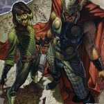
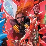
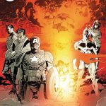
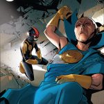
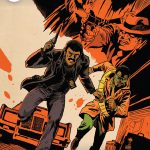
Can we talk about how ugly the trade dress for Marvel’s Original Sin crossovers is? It somehow manages to make every single piece of art it comes in contact with less impactful and each title so much more generic. (Also, maybe it’s just me, but a lot of the art on these covers seem to have weirdly empty top left corners. I wonder if they expected different trade dress?)